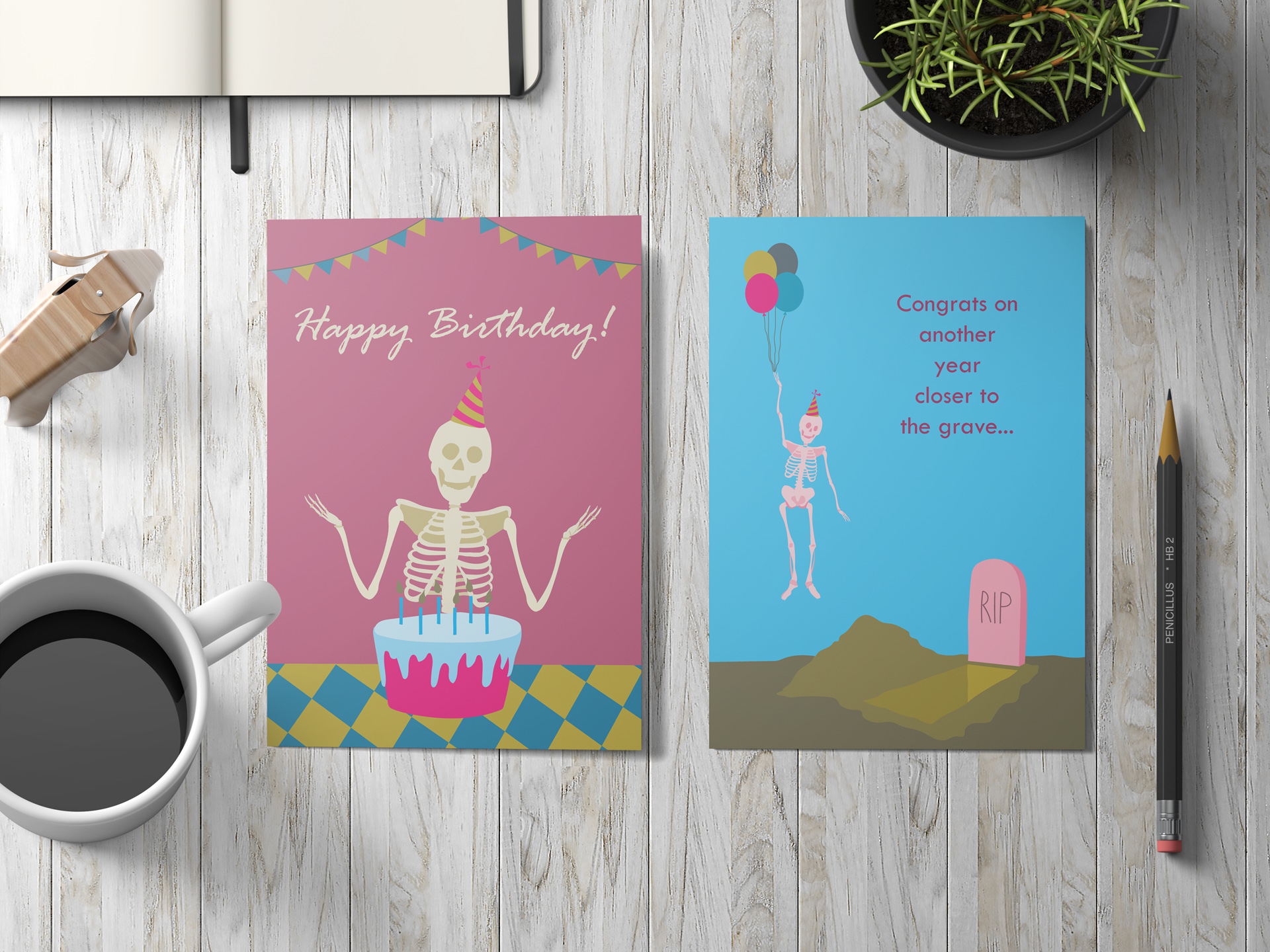
Exploring the Color Palettes
To make the design adaptable and visually engaging, I developed four distinct color schemes for the card. Each palette brings a unique feel to the design while maintaining consistency in its playful and humorous tone.
Triadic Palette
Vibrant and dynamic mix of three equally spaced colors on the color wheel, creating a bold and eye-catching contrast.


Analogous Palette
A harmonious combination of neighboring colors for a softer, more natural effect.
Monochromatic Palette
A sleek and cohesive design using shades, tones, and tints of a single hue for a clean and elegant feel.


Complementary Palette
Contrasting colors from opposite sides of the wheel for a high-impact, balanced look.
These options allow the card to resonate with diverse audiences and make the design more versatile for different contexts.

